How to Master Data Storytelling with Visuals
How to Master Data Storytelling with Visuals
Data storytelling with visuals combines data and narrative to engage and inform. It turns complex information into actionable insights through impactful storytelling and visuals essential in today’s crowded information landscape. Why is this important?
Effective data communication is vital now more than ever. Compelling visuals turn numbers into stories, capturing interest and driving decisions. With the right tools, anyone can transform a bland dataset into something that resonates. Data storytelling is widely used—from business strategies to scientific findings, proving its value across fields.
This post covers the fundamentals of successful data storytelling and guides you in designing visuals to fit your narrative. You’ll discover tools and techniques, best practices for story cohesion, and how to apply data storytelling in various scenarios. Ready to transform your data into meaningful stories? Let’s start.
The Core Principles of Data Storytelling
Data storytelling is more than just presenting statistics; it’s about creating a narrative that connects with people. Each data story must have a clear goal, which guides the narrative and resonates with the audience.
Start by selecting key metrics relevant to your story. These metrics are essential as they back up your narrative with concrete evidence. For instance, in a story about customer satisfaction, use metrics like Net Promoter Score (NPS) or feedback ratings to highlight trends and areas for improvement.
Data accuracy is crucial. Ensure thorough analysis for trustworthy data presentation. Inaccurate data can mislead and erode trust. Cross-verify data from surveys, databases, or external research to maintain integrity.
A good story structure is vital. It guides the audience, keeping them engaged and amplifying the story’s impact. Successful data stories often use a narrative arc with context, conflict, and resolution. For example, detailing how a company reversed declining sales through strategic changes can engage and inform.
Blending data with narrative transforms raw numbers into stories that drive action. Visuals, which we will discuss next, play a key role in enhancing understanding and engagement by making data accessible and appealing.
Designing Effective Visuals for Data Stories
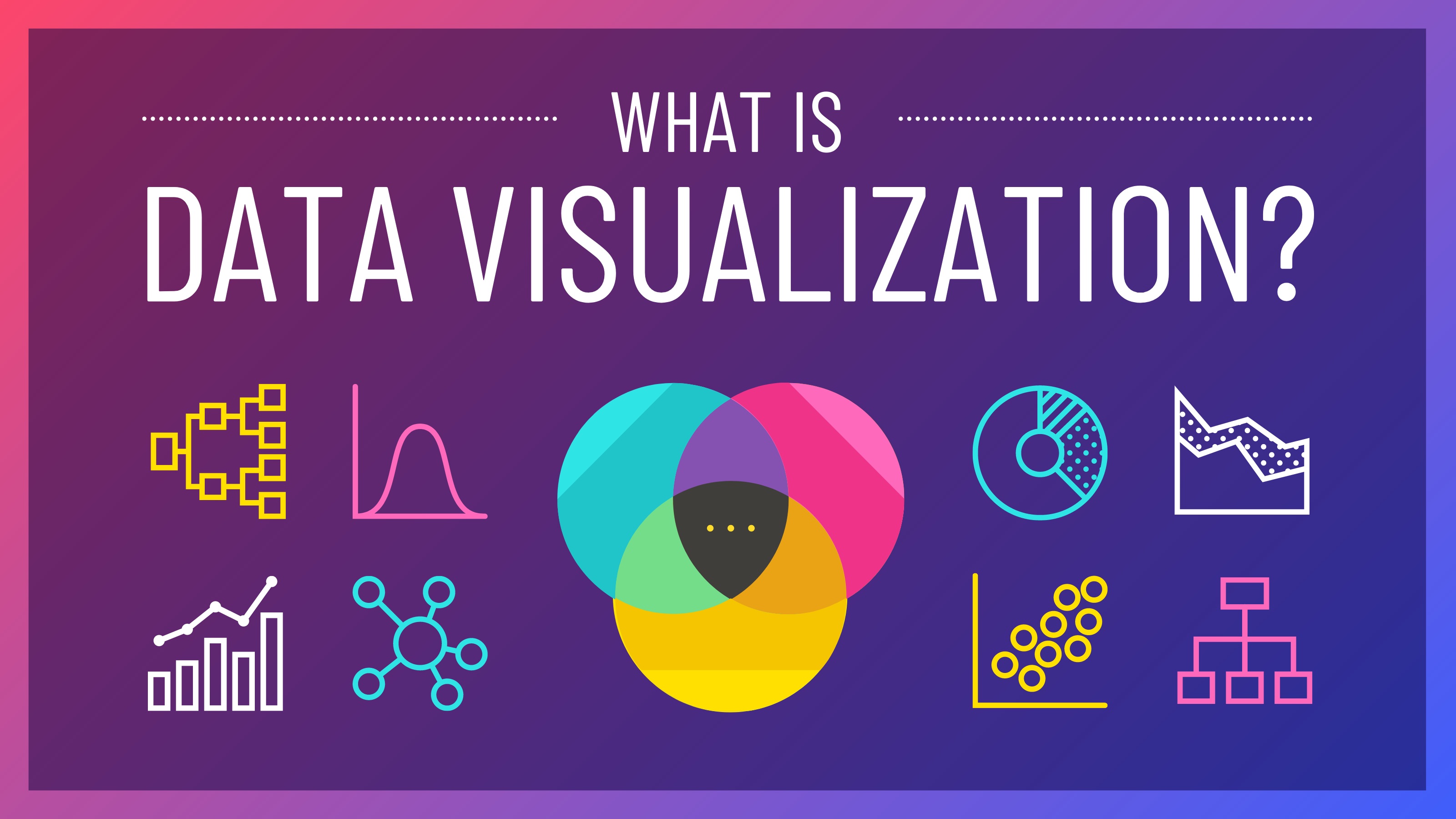
Data storytelling combines analysis and creativity, revealing insights and communicating them clearly. Core to this are visuals, which simplify complex details. Use the right type of visualisation, like line graphs for trends or pie charts for proportions, to help audiences understand the data simply.
Visual design impacts perception. Color schemes can accentuate data points, while appropriate fonts enhance readability. Choose colors that consider visual impairments and ensure good contrast for clarity.
Tools like Tableau are invaluable for creating attractive and informative visuals without needing graphic design expertise. They offer flexibility to manipulate data in real-time, and features for easy sharing and teamwork.
With impactful visual tools in mind, let’s explore how technology aids in transforming raw data into engaging narratives. Stay with us as we reveal innovative solutions for effortless data storytelling.
Tools for Data Storytelling
Using the right tools can enhance your data storytelling, turning complex data into clear, actionable insights. Here’s a look at some leading platforms for visualisation and analysis:
-
Tableau: Known for its user-friendly design, Tableau allows creating interactive and beautiful data visuals with a simple drag-and-drop feature. It’s perfect for those new to tech while connecting various data sources for extensive analysis.
-
Power BI: This Microsoft tool combines strong analytics with impressive visuals. It works well with other Microsoft products for easy integration and collaboration, letting teams create detailed visual reports accessible from anywhere.
-
Google Data Studio: A free, easy-to-use tool that works with Google products like Analytics and BigQuery. It offers customisable reports with engaging visuals to make raw data meaningful and actionable.
These tools streamline data storytelling, offering real-time analysis and visualisations. In the next section, we’ll explore best practices to make your data stories accurate, engaging, and memorable.
Crafting Effective Data Stories
Creating a compelling data story is about balancing clarity, simplicity, and engagement. The following practices will help in crafting influential data narratives that resonate with your audience:
-
Keep It Simple and Clear: Avoid overwhelming your audience with complexity. Use clear visuals and messages to make data understandable, emphasising the main insights without losing their impact.
-
Understand Your Audience: Design visuals that match your audience’s data literacy. For non-technical viewers, highlight key insights with simple graphics rather than intricate datasets to ensure understanding and engagement.
-
Enhance Interactivity: Interactive elements help engage and deepen understanding. Use features like clickable charts or animated visuals to allow audiences to explore the data story at their pace, making the information accessible and significant.
Data storytelling is about more than just numbers. It’s about crafting stories that drive action or change perceptions. By following these practices, you’ll create narratives that inform and inspire. In the next section, we will look at how these principles are applied in real-world scenarios, where data stories shape business strategies and enhance consumer engagement.
Real-World Applications of Data Storytelling
Data storytelling is vital in today’s digital world for sharing complex data with clear narratives. Across different sectors, companies use this to gain insights and make informed choices, showcasing its power through real examples.
Retailers excel in using data storytelling to enhance customer experiences and boost strategies. By using heat maps, they analyse and visualise how customers move within stores. This reveals areas with high foot traffic and engagement, helping refine store designs and improve inventory management and marketing. For example, a major retailer might shift product placement in well-visited aisles based on these insights.
Social networks also benefit greatly. User interactions are mapped through social network graphs, shedding light on connections and topics. These graphs help identify influencers and trends, as seen in a leading social media company that used them during a campaign. This allowed them to adjust their strategies, improving user engagement and retention.
Turning raw data into engaging stories combines art and science, helping teams align and share insights effectively. Data storytelling transforms visuals into actionable information, offering real strategic advantages.
Conclusion
Data storytelling combines facts and visuals to create stories that engage and inspire audiences. It turns raw numbers into stories that influence and drive change. By integrating storytelling principles, data presentations can move beyond charts and spreadsheets to become vivid, impactful narratives.
Creating effective visuals supports your narrative by making complex data accessible and memorable. Advanced tools can enhance how you share intricate details compellingly.
Best practices, such as refining story flow and strategic visual use, define successful data storytelling. Real-world examples show its importance in fields from business to education, offering a competitive advantage.
As you enhance your storytelling skills, ask yourself how your next story can not only inform but inspire change. Explore the art of data storytelling and unlock the full potential of your data-driven stories in real-world applications.
