Data Storytelling: The Art of Transforming Insights into Actionable Decisions
Authored by: Victoria Abimbola Arowolo
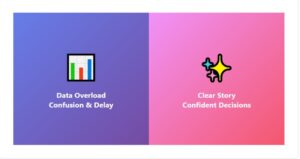
Picture this: Your leadership team sits in a conference room looking at a dashboard with 23 different charts. Revenue trends, customer metrics, operational KPIs, everything is there. The data is accurate. The visuals are polished. Yet after 45 minutes, the meeting ends with the same question it started with: “So what should we actually do?”
This scenario plays out in organizations every day. The problem isn’t the lack of data or even the lack of analytics. It’s the absence of storytelling.
At Onyx Data, we’ve observed a consistent pattern: organizations that excel at data storytelling make faster, more confident decisions than those that simply produce reports. The difference? They’ve mastered the art of turning insights into narratives that drive action.
What Data Storytelling Actually Means
Data storytelling isn’t about making dashboards prettier or adding more charts. It’s the deliberate craft of weaving together three essential elements:
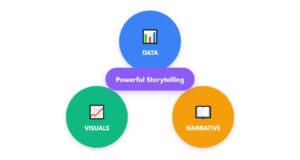
- Data
The foundation, accurate, well-modeled information that reveals truth about your business.
- Visuals
Strategic charts and graphics that make complex patterns immediately understandable.
- Narrative
The connective tissue that explains what’s happening, why it matters, and what comes next.
When these three elements work together, something powerful happens: insights transform into decisions. Remove any one element, and the story collapses.
Without narrative, data becomes overwhelming noise.
Without visuals, insights remain buried in complexity.
Without accuracy, the entire foundation crumbles.
Why Organizations Need Data Storytelling
Most business leaders aren’t data scientists. They don’t think in SQL queries, DAX measures, or statistical models. They think in outcomes, risks, opportunities, and timelines.
Data storytelling translates analytical findings into the language of business strategy. Here’s why it matters:
Stories Create Memory
Which is more memorable: “Customer retention increased 12 percent” or “We prevented 2,400 customers from leaving this quarter by addressing a delivery delay issue that our competitors still haven’t fixed”? The second version sticks because it’s a story with characters, conflict, and resolution.
Stories Reduce Decision Paralysis
Executives face dozens of metrics daily. A clear narrative cuts through the noise and focuses attention on what truly demands action. When everything is highlighted, nothing stands out. A well-crafted story directs the spotlight exactly where it needs to be.
Stories Align Diverse Teams
Your finance team sees profitability. Marketing sees customer acquisition. Operations sees efficiency. A unified data story gives everyone the same lens to view business reality, enabling coordinated action across functions.
Stories Build Trust in Insights
People trust what they understand. When analytics teams explain not just the “what” but the “why” and “how,” stakeholders develop confidence in data-driven recommendations. Trust accelerates adoption.
Stories Connect Analysis to Action
The ultimate goal of any analysis is to influence what happens next. A compelling data story naturally leads to decisions because it’s structured to guide the audience from insight to implication to recommendation.
The Anatomy of a Powerful Data Story
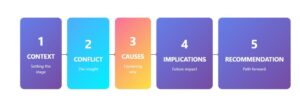
Every effective data story follows a natural arc. Understanding this structure helps analysts move beyond reporting into true storytelling:
- Context: Setting the Stage
Every story needs a setting. In data storytelling, context answers: What problem are we examining? Why does this matter now? What’s at stake?
Without context, even the most interesting insight feels disconnected from business reality.
Example framing:
“For the past three quarters, we’ve maintained steady customer retention rates of 92-94 percent. This quarter, retention dropped to 87 percent—our lowest performance in two years. Understanding this shift is critical as we enter our peak revenue season.”
- Conflict: The Insight That Demands Attention
This is where your data reveals something unexpected, concerning, or opportunity-rich. The conflict creates tension that pulls your audience into the story.
Example:
“The retention drop isn’t uniform across our customer base. Long-term customers remain loyal at 95 percent retention. But first-time customers are churning at 34 percent—nearly triple our historical rate.”
This specific insight transforms a general problem into a focused challenge.
- Causes: Explaining the Why
Now your analysis digs deeper to uncover root causes. This is where analytical techniques shine:
- Cohort analysis revealing when the problem started
- Segmentation showing which customer groups are affected
- Trend analysis identifying correlated factors
- Statistical testing ruling out random variation
Example:
“Analysis shows the spike in first-time customer churn correlates precisely with our new onboarding process launched in April. Customers who experienced the old onboarding flow showed 89 percent retention. Those in the new flow: 66 percent retention. Survey data indicates confusion about product features and longer time-to-value.”
- Implications: Painting the Future
Here you answer: What happens if we do nothing? What opportunities exist if we act?
Implications make the story urgent. People change course when they clearly see consequences.
Example:
“If this 34 percent first-time customer churn rate continues, we project losing $2.8 million in recurring revenue over the next 12 months. Additionally, our customer acquisition cost effectiveness drops by 40 percent since we’re essentially buying customers who leave before generating ROI.”
- Recommendation: The Path Forward
A data story without a recommendation is incomplete. This is where analysis becomes strategy.
Effective recommendations are:
- Specific: Not “improve onboarding” but “revert to the previous onboarding flow while we redesign the new version with user feedback”
- Actionable: Leaders can immediately approve and implement
- Measurable: Include how you’ll track if it’s working
Example:
“We recommend three immediate actions: First, revert new customers to our proven onboarding flow starting next week. Second, conduct user testing with 20 recent customers to identify specific pain points in the new process. Third, implement a 30-day check-in email for all first-time customers to catch and address issues early. We’ll measure success through 30-day retention rates, targeting a return to 85+ percent within six weeks.”
The Technical Foundation of Effective Storytelling
While storytelling sounds creative, it rests on rigorous technical discipline. Here’s what separates compelling data stories from wishful thinking:
Strong Data Modeling
Your story is only as credible as the data behind it. This requires:
- Properly structured star or snowflake schemas
- Clean relationships between fact and dimension tables
- Correct grain and granularity
- Consistent naming conventions
- Well-documented measure logic
- Regular data quality checks
Weak data modeling produces misleading insights that undermine trust in your entire analytics function.
Strategic Visual Selection
The wrong chart destroys clarity faster than the wrong data. Match your visual to your message:
- Line charts reveal trends and changes over time
- Bar charts compare values across categories
- Scatter plots show relationships and correlations
- Heatmaps display patterns across two dimensions
- Waterfall charts break down how components contribute to totals
- Decomposition trees guide diagnostic analysis
Visual literacy is as important as statistical literacy for modern analysts.
Insight Over Metrics
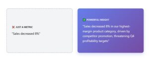
There’s a crucial difference:
- A metric tells you what happened: “Sales decreased 8 percent”
- An insight explains why it matters: “Sales decreased 8 percent in our highest-margin product category, driven by a competitor’s aggressive promotion, threatening our Q4 profitability targets”
Data storytelling lives in the insights, not the metrics.
Analytical Rigor
Strong stories employ appropriate analytical techniques:
- Cohort analysis to understand behavior over time
- Segmentation to identify which groups drive patterns
- Anomaly detection to catch unusual events
- Statistical testing to separate signal from noise
- Predictive modeling to quantify future scenarios
- Funnel analysis to diagnose conversion issues
- Time series decomposition to understand seasonal effects
These methods prevent superficial conclusions and build narrative credibility.
Audience-Centric Design
The same data tells different stories to different audiences. Shape your narrative around your decision-maker’s world:
- What outcomes are they measured on?
- What keeps them awake at night?
- What would success look like for them?
- What constraints do they operate under?
- What’s their level of data literacy?
Technical brilliance means nothing if your audience can’t connect your insights to their reality.
Common Data Storytelling Mistakes (And How to Avoid Them)
Even experienced analytics teams fall into these traps:
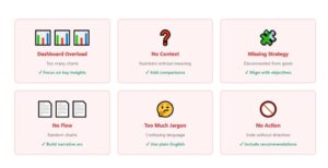
- Dashboard Overload
The mistake: Cramming 15 visuals onto one screen, believing more charts equal better understanding.
The fix: Focus each dashboard page on answering one key question. If a visual doesn’t support that question, remove it. White space improves comprehension.
- Showing Data Without Context
The mistake: “Revenue is $1.2M” without explaining whether that’s good, bad, expected, or concerning.
The fix: Always provide comparison points: prior period, target, forecast, industry benchmark, or historical range.
- Forgetting Business Strategy
The mistake: Presenting technically accurate analysis that’s disconnected from what the business is trying to achieve.
The fix: Start every analysis by understanding the strategic question you’re trying to answer. Let strategy drive your analytical approach.
- No Narrative Flow
The mistake: A collection of interesting charts with no connective logic—forcing the audience to assemble the story themselves.
The fix: Use annotations, callouts, and page titles that explicitly guide viewers through your narrative arc.
- Technical Jargon Overload
The mistake: “The p-value of 0.03 indicates statistical significance in the multivariate regression model.”
The fix: “We tested whether this change was random or real. The data strongly confirms it’s real and meaningful.”
- Missing Call to Action
The mistake: Ending with “Here’s what the data shows” instead of “Here’s what we should do.”
The fix: Every data story should conclude with a clear recommendation or decision point. Give your audience the gift of clarity.
Building a Data Storytelling Culture
Organizations don’t become good at data storytelling by accident. It requires intentional cultural development:
Train Beyond Technical Skills
Most analytics training focuses on tools, Power BI, Tableau, Python, SQL. Invest equally in communication skills: writing executive summaries, presenting to non-technical audiences, and structuring compelling narratives.
Create Storytelling Templates
Develop standard formats for common analytical outputs:
- Executive insight summaries (one page, focuses on implications and recommendations)
- Deep-dive analyses (full story arc with supporting detail)
- Dashboard annotations (guiding viewers to key insights)
- Decision memos (analysis that directly supports a pending decision)
Templates ensure consistency and reduce the cognitive load of “starting from scratch.”
Prioritize Narrative-Driven Dashboards
Stop building “self-service” dashboards that dump data on users and hope they figure it out. Instead, create guided experiences that walk viewers through insights in a logical sequence, with clear takeaways at each step.
Integrate Storytelling Into Business Reviews
Monthly and quarterly business reviews should be story-driven, not chart-driven. Reserve dashboard exploration for working sessions. Leadership meetings deserve curated narratives that respect everyone’s time and drive to conclusions.
Celebrate Impact, Not Output
Shift your analytics team’s success metrics from “dashboards built” and “reports delivered” to “decisions influenced” and “outcomes improved.” Recognize when analysis changes strategy, prevents mistakes, or unlocks opportunities.
When analysts see that storytelling drives their professional impact, they’ll invest in mastering the skill.
The Competitive Advantage of Great Data Storytelling
In an era where every organization has access to powerful analytics tools and vast data resources, competitive advantage increasingly comes not from having data but from using it effectively.
Organizations with strong data storytelling capabilities:
Move Faster
Clear narratives accelerate decision-making. When stakeholders immediately grasp what data means, decisions happen in days instead of weeks.
Align Better
Shared stories create shared understanding. Cross-functional teams coordinate more effectively when everyone interprets data through the same narrative lens.
Execute More Confidently
Leaders make bolder moves when they trust the analysis. Good storytelling builds that trust by making the logic transparent and the implications clear.
Learn Continuously
Organizations that frame analytics as storytelling naturally develop feedback loops. They track whether recommendations worked, learn from outcomes, and refine future stories.
Attract Better Talent
Top analysts want their work to matter. Teams known for influential storytelling attract professionals who value impact over just technical sophistication.
Moving Forward: From Data to Decisions
The goal of analytics isn’t to produce dashboards. It’s to produce better decisions—faster decisions, more confident decisions, more aligned decisions.
Data storytelling is the bridge that connects analytical insight to business action. It transforms information from something interesting into something actionable.
As data volumes grow and analytical tools become more powerful, the organizations that thrive won’t be those with the most data or the fanciest dashboards. They’ll be those that can cut through complexity with clear, compelling stories that drive their teams toward better outcomes.
At Onyx Data, we believe the future of analytics isn’t just in sophisticated models or beautiful visualizations it’s in the human skill of storytelling. It’s in helping organizations see not just what their data says, but what it means and what to do about it.
The question isn’t whether your organization has data. The question is: what story is your data telling, and is anyone listening?
Ready to Strengthen Your Data Storytelling?
If your organization struggles to turn insights into action, or if your dashboards aren’t driving the decisions you hoped for, let’s talk. At Onyx Data, we help teams develop the storytelling capabilities that transform analytics from interesting to indispensable.
Contact Onyx Data to discuss how we can help your team tell better data stories.
About Onyx Data: We partner with organizations to transform their data into strategic assets. Through a combination of advanced analytics, thoughtful design, and narrative clarity, we help teams make better decisions faster. Learn more at onyxdata.co.uk.